Visualize GitHub Copilot metrics
This guide is scoped to GitHub Copilot. If you also operate other AI coding tools (e.g. Claude Code, Cursor), you can layer them on top of the same foundations described here. See Extending to other AI tools at the end of the guide.
Engineering organizations are investing heavily in AI coding assistants, but most cannot answer basic ROI questions: how many licensed seats are actively used, which teams are getting value, and whether suggestions are being kept or thrown away? Without per-user and per-team visibility, AI tooling budgets grow based on enthusiasm rather than evidence.
This guide walks you through building a comprehensive GitHub Copilot adoption dashboard in Port. We will set up the data model, connect the GitHub Copilot integration to ingest live usage data, and build a dashboard on top of it. Once the integration is running and data is flowing, you can answer questions at three levels. The questions below are examples to get you started, not an exhaustive list:
- Organization: What share of Port users actively use Copilot, what is the acceptance rate, and how many seats are inactive?
- Team: Which teams are leading or lagging on Copilot adoption, acceptance, and LOC efficiency?
- User: Which contributors are driving accepted lines of code, which users have low engagement, and which Copilot users have zero output?
These three levels map to Port's Organization, Team, and User blueprints, but the structure is flexible and can mirror however your own organization is shaped, for example nesting teams into departments or business units. See example organization hierarchies for the patterns you can model.
By the end of this guide, you will have a dashboard that provides full visibility into Copilot adoption and impact, helping you identify enablement opportunities and quantify ROI.
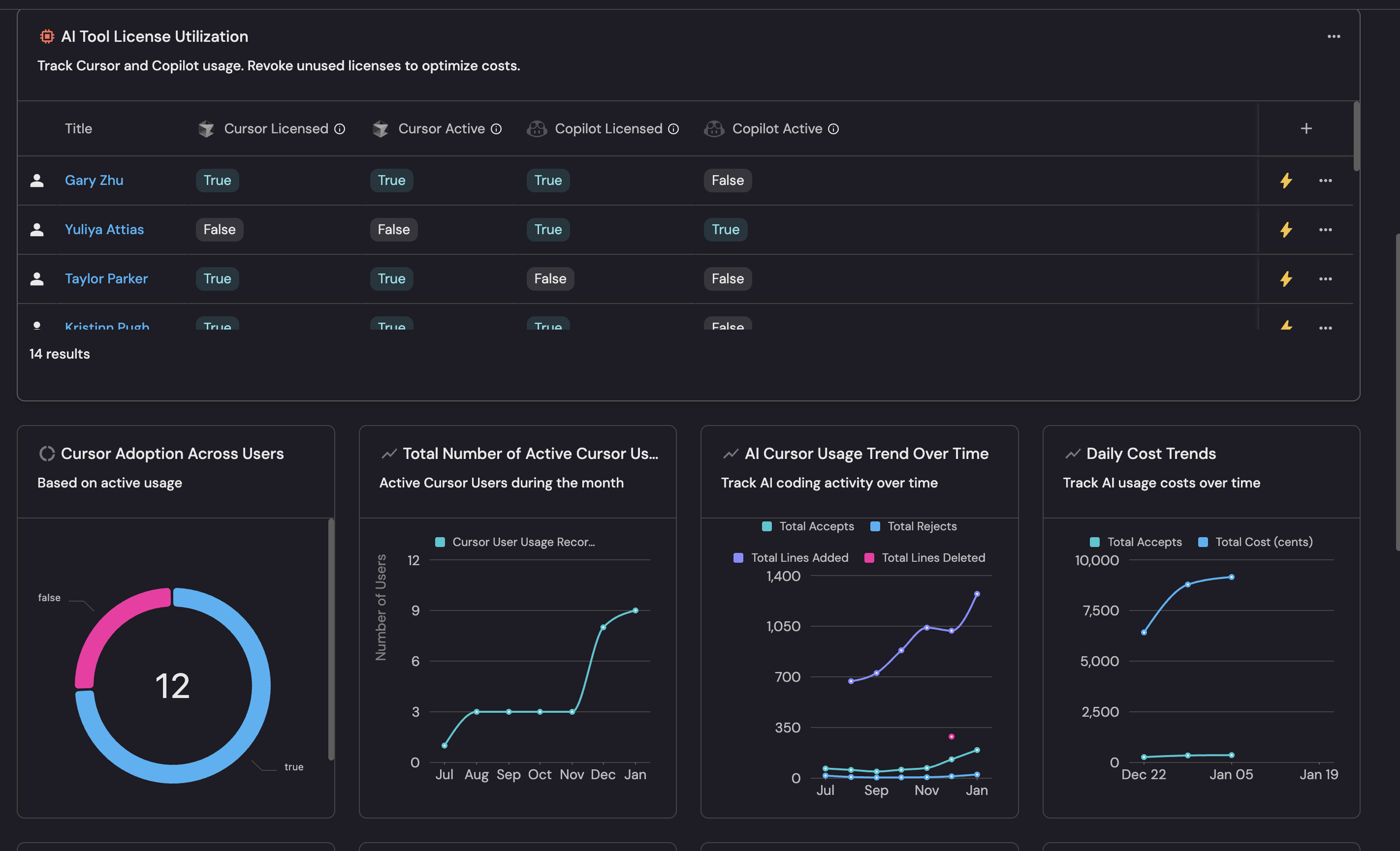
The image above shows only the top portion of the dashboard as an example. The full dashboard built in this guide includes additional team, user, and activity-trend widgets further down.
Common use cases
- Track Copilot license utilization (active vs inactive seats) across the organization.
- Surface low-engagement Copilot users who may benefit from enablement sessions.
- Compare Copilot adoption rates and acceptance rates across teams to identify outliers.
- Monitor daily Copilot activity, LOC trends, and acceptance trends over time.
- Identify "Copilot active but zero output" users whose suggestions are not landing in code.
- Correlate Copilot adoption with engineering outcomes such as PR delivery metrics, DORA metrics, or pipeline reliability to see whether higher AI usage actually improves delivery.
Modeling Copilot data in Port
Port lets you visualize and model Copilot data based on your organization's structure. Usage is attributed to your User, Team, and Organization entities and enriched with derived metrics such as adoption rate, adoption tier, acceptance rate, and LOC efficiency, so you can compare teams, drill into individual users, sort by service ownership, and feed scorecards.
You can also chart the raw daily Copilot records (githubCopilotUserUsage / githubCopilotOrganizationUsage) directly whenever you want day-by-day trends or org-wide totals across every seat reported by GitHub. By default these records are not related to your Team, service, or other catalog entities, so you cannot group them by those attributes unless you extend the integration mapping to relate the records to them.
The dashboard built in this guide uses both. The headline KPI tiles and team/user tables are attributed to your catalog entities, while the day-by-day activity-trend charts at the bottom chart the raw Copilot records.
We recommend assigning every Port user who uses an AI coding tool to their matching AI tool profile (such as Copilot). This is what lets you model Copilot data on your organization's structure: it lets you understand AI adoption at the team level, see how usage breaks down across teams and services, build scorecards that grade teams against adoption targets, and trigger workflows based on usage (for example, flagging inactive seats or low-engagement users). Without it, you are limited to raw daily trends and org-wide totals, and lose the ability to compare and act on usage across your organization.
Prerequisites
This guide assumes the following:
- You have a Port account and have completed the onboarding process.
- You have completed the Create foundational Engineering Intelligence data model guide, which provisions the core Organization, Team, and User blueprints.
- Port's GitHub Copilot integration is installed in your account and ingesting data from at least one GitHub organization or enterprise.
- The
githubCopilotUserUsageandgithubCopilotOrganizationUsageblueprints already exist (these are created automatically when you install the GitHub Copilot integration).
Key metrics overview
The tables below are examples of metrics worth tracking at each scope. They are not exhaustive: the data model in this guide can produce many more, and you should add or drop metrics to match the questions your organization actually wants answered. Treat each list as a starting point for the widgets you build later.
- User
- Team
- Group
- Organization
| Metric | What it measures | Why it matters |
|---|---|---|
| Days active (monthly) | Number of days the user had any Copilot activity | Headline engagement signal for an individual |
| Adoption tier | None / Low (1-5 d) / Medium (6-15 d) / High (16+ d) | Bucket users for enablement, recognition, or license review |
| Acceptance rate | Accepted suggestions / generated suggestions | Whether the user finds Copilot suggestions useful |
| LOC efficiency | Lines kept / lines suggested | How much of what Copilot proposes lands in their code |
| LOC added (monthly) | Sum of Copilot-accepted lines added this month | Concrete contribution Copilot made to this person's code |
| Chat / Agent days | Days the user engaged Chat or Agent features | Adoption of features beyond inline completion |
| Metric | What it measures | Why it matters |
|---|---|---|
| Adoption rate (%) | Share of team members active on Copilot this month | Direct comparison of team-level adoption |
| Adoption tier | None / Low (1-33%) / Medium (34-66%) / High (67-100%) | One-glance bucket for leadership reporting |
| Acceptance rate | Aggregated accepted / generated suggestions | Whether the team uses Copilot effectively, not just frequently |
| LOC efficiency (%) | Aggregated lines kept / lines suggested | How much Copilot output the team actually keeps |
| LOC added (monthly) | Sum of Copilot-accepted lines across team members | Volume of Copilot contribution per team |
| High adopters (count) | Team members in the High tier (16+ days) | Identifies pockets of deep adoption |
| Inactive users (count) | Members with a Copilot seat but zero activity | Surface licenses that could be reassigned |
A Group is a Team whose type is group, typically a parent team representing a department, business unit, or product area. The metrics are identical to the Team tab, but each row aggregates the data of all child teams (because Team-blueprint aggregations sum across child_* properties).
| Metric | What it measures | Why it matters |
|---|---|---|
| Adoption rate (%) | Share of group members (including child teams) active on Copilot | Compare departments or business units |
| Adoption tier | None / Low / Medium / High | Roll-up bucket for executive reporting |
| Acceptance rate | Aggregated across all child teams | Effectiveness signal at the BU / department level |
| LOC efficiency (%) | Aggregated across all child teams | Same as Team, one level up |
| LOC added (monthly) | Sum across the entire group | Total Copilot contribution per group |
| High adopters (count) | Members in the High tier across the group | Where the heavy adopters are concentrated |
| Metric | What it measures | Why it matters |
|---|---|---|
| Adoption rate (%) | % of Port users active on Copilot this month | Headline KPI for the entire org |
| Active users (count) | Distinct users with at least one day of Copilot activity | Absolute volume of engaged seats |
| Inactive users (%) | Copilot users with zero activity / all Copilot users | Wasted licenses ripe for reclamation |
| Acceptance rate | Org-wide accepted / generated suggestions | Aggregate signal of suggestion quality |
| LOC efficiency (%) | Org-wide lines kept / lines suggested | How much Copilot output reaches the codebase org-wide |
| High adopter rate (%) | % of Port users reaching the High tier | How many people use Copilot deeply, not just occasionally |
| Daily activity trend | Suggestions generated vs accepted per day (raw Copilot records) | Day-over-day growth or decline in usage |
| LOC trend | Lines suggested vs added per day (raw Copilot records) | Whether accepted code volume is moving up or down |
| Chat & Agent adoption | Days users engaged Copilot Chat / Agent (raw Copilot records) | Adoption of features beyond inline completions |
Set up data model
Throughout this guide, blueprint and property titles (what you see in the Port UI) are written in bold, and their identifiers (what you use in JSON and integration mappings) in code formatting - for example, the AI User Profile blueprint has the identifier ai_user.
The GitHub Copilot integration automatically creates two blueprints when installed:
- GitHub Copilot User Usage (
githubCopilotUserUsage) - daily per-user Copilot activity records - GitHub Copilot Organization Usage (
githubCopilotOrganizationUsage) - daily per-org Copilot activity records
In this guide, we will:
- Create two new blueprints that serve as tool-agnostic foundations for AI activity:
- AI User Profile (
ai_user) - AI Org Profile (
ai_org)
- AI User Profile (
- Extend the existing GitHub Copilot User Usage (
githubCopilotUserUsage), GitHub Copilot Organization Usage (githubCopilotOrganizationUsage), User, Team, and Organization blueprints with the calculation and aggregation properties (and relations) needed to surface Copilot adoption metrics at user, team, and organization scope.
The data model touches the following blueprints and relations. Use this as a reference whenever an identifier appears later in the guide:
| Title (identifier) | Type | Role |
|---|---|---|
GitHub Copilot User Usage (githubCopilotUserUsage) | Blueprint (integration-owned) | Daily per-user Copilot activity records |
GitHub Copilot Organization Usage (githubCopilotOrganizationUsage) | Blueprint (integration-owned) | Daily per-org Copilot activity records |
AI User Profile (ai_user) | Blueprint (created here) | Per-tool AI activity profile, one per user per tool |
AI Org Profile (ai_org) | Blueprint (created here) | Per-tool AI activity profile, one per organization |
User (_user) | Blueprint (foundation) | Port users; surfaces each person's Copilot metrics |
Team (_team) | Blueprint (foundation) | Port teams; rolls up member and child-team metrics |
Organization (organization) | Blueprint (foundation) | The organization; holds org-wide KPIs |
AI Tools (ai_tools) | Relation on User → AI User Profile | Links each Port user to their AI profile(s); every user/team/org rollup traverses it |
AI User Profile (copilot_user) | Relation on GitHub Copilot User Usage → AI User Profile | Wires each daily user record to its profile. Copilot-specific; other AI tools add their own <tool>_user relation |
AI Org Profile (copilot_org) | Relation on GitHub Copilot Organization Usage → AI Org Profile | Wires each daily org record to its profile. Copilot-specific; other AI tools add their own <tool>_org relation |
Create the AI User Profile blueprint
The ai_user blueprint stores the per-tool AI activity profile for each person. One entity per user per tool. It is the bridge between the raw per-day githubCopilotUserUsage records and each person's Port User profile.
-
Go to your Builder page.
-
Click
+ Blueprintand choose Create from JSON. -
Paste the following JSON and click Create:
AI User Profile blueprint (click to expand)
{"identifier": "ai_user","title": "AI User Profile","icon": "User","description": "Per-tool AI activity profile for a person. One entity per tool (Copilot, Claude, …).","schema": {"properties": {"display_name": {"icon": "User", "title": "Display Name", "type": "string"},"email": {"format": "user", "icon": "User", "title": "Email", "type": "string"},"copilot_username": {"title": "Copilot Username", "icon": "DefaultProperty", "type": "string"},"tool": {"title": "AI Tool","icon": "DefaultProperty","type": "string","enum": ["Copilot"],"enumColors": {"Copilot": "blue"}}},"required": []},"mirrorProperties": {},"calculationProperties": {},"aggregationProperties": {},"relations": {}}Multiple AI toolsThe
toolenum only includesCopilotfor this guide. If you later layer Claude Code, Cursor, etc. on top of the same foundation, add their identifiers to this enum. -
Once created, open the blueprint, click the
{...}button in the top right corner, choose Edit JSON, and merge the following entries into itsaggregationPropertiessection:AI User Profile aggregation properties (click to expand)
"copilot_code_acceptances_monthly": {"title": "Copilot Code Acceptances (Monthly)","type": "number","target": "githubCopilotUserUsage","query": {"combinator": "and","rules": [{"operator": "between", "property": "record_date", "value": {"preset": "lastMonth"}}]},"calculationSpec": {"calculationBy": "property","func": "sum","property": "code_acceptance_activity_count"}},"copilot_code_generations_monthly": {"title": "Copilot Code Generations (Monthly)","type": "number","target": "githubCopilotUserUsage","query": {"combinator": "and","rules": [{"operator": "between", "property": "record_date", "value": {"preset": "lastMonth"}}]},"calculationSpec": {"calculationBy": "property","func": "sum","property": "code_generation_activity_count"}},"copilot_days_active_monthly": {"title": "Copilot Days Active (Monthly)","type": "number","target": "githubCopilotUserUsage","query": {"combinator": "and","rules": [{"operator": "between", "property": "record_date", "value": {"preset": "lastMonth"}}]},"calculationSpec": {"calculationBy": "entities","func": "count"}},"copilot_days_using_agent_monthly": {"title": "Copilot Days Using Agent (Monthly)","type": "number","target": "githubCopilotUserUsage","query": {"combinator": "and","rules": [{"operator": "=", "property": "used_agent", "value": true},{"operator": "between", "property": "record_date", "value": {"preset": "lastMonth"}}]},"calculationSpec": {"calculationBy": "entities","func": "count"}},"copilot_days_using_chat_monthly": {"title": "Copilot Days Using Chat (Monthly)","type": "number","target": "githubCopilotUserUsage","query": {"combinator": "and","rules": [{"operator": "=", "property": "used_chat", "value": true},{"operator": "between", "property": "record_date", "value": {"preset": "lastMonth"}}]},"calculationSpec": {"calculationBy": "entities","func": "count"}},"copilot_interactions_monthly": {"title": "Copilot Interactions (Monthly)","type": "number","target": "githubCopilotUserUsage","query": {"combinator": "and","rules": [{"operator": "between", "property": "record_date", "value": {"preset": "lastMonth"}}]},"calculationSpec": {"calculationBy": "property","func": "sum","property": "user_initiated_interaction_count"}},"copilot_loc_added_monthly": {"title": "Copilot LOC Added (Monthly)","type": "number","target": "githubCopilotUserUsage","query": {"combinator": "and","rules": [{"operator": "between", "property": "record_date", "value": {"preset": "lastMonth"}}]},"calculationSpec": {"calculationBy": "property","func": "sum","property": "loc_added_sum"}},"copilot_loc_deleted_monthly": {"title": "Copilot LOC Deleted (Monthly)","type": "number","target": "githubCopilotUserUsage","query": {"combinator": "and","rules": [{"operator": "between", "property": "record_date", "value": {"preset": "lastMonth"}}]},"calculationSpec": {"calculationBy": "property","func": "sum","property": "loc_deleted_sum"}},"copilot_loc_suggested_monthly": {"title": "Copilot LOC Suggested (Monthly)","type": "number","description": "Total lines suggested by Copilot this month before acceptance/rejection","target": "githubCopilotUserUsage","query": {"combinator": "and","rules": [{"operator": "between", "property": "record_date", "value": {"preset": "lastMonth"}}]},"calculationSpec": {"calculationBy": "property","func": "sum","property": "loc_suggested_to_add_sum"}} -
Merge the following entries into the existing
calculationPropertiessection (keep any properties already there):AI User Profile calculation properties (click to expand)
"copilot_acceptance_rate": {"title": "Copilot Acceptance Rate (%)","icon": "Metric","description": "Percentage of Copilot suggestions accepted this month","calculation": "if (.properties.copilot_code_generations_monthly // 0) > 0 then ((.properties.copilot_code_acceptances_monthly // 0) / .properties.copilot_code_generations_monthly) * 100 | round else 0 end","type": "number"},"copilot_loc_efficiency": {"title": "Copilot LOC Efficiency (%)","icon": "Metric","description": "Percentage of Copilot-suggested lines actually kept","calculation": "if (.properties.copilot_loc_suggested_monthly // 0) > 0 then ((.properties.copilot_loc_added_monthly // 0) / .properties.copilot_loc_suggested_monthly) * 100 | round else 0 end","type": "number"} -
Click Save to update the blueprint.
Create the AI Org Profile blueprint
The ai_org blueprint stores per-tool AI activity for an organization (e.g. one entity per GitHub organization sending Copilot data). It is the bridge between the raw per-day githubCopilotOrganizationUsage records and your core organization entity.
-
Go to your Builder page.
-
Click
+ Blueprintand choose Create from JSON. -
Paste the following JSON and click Create:
AI Org Profile blueprint (click to expand)
{"identifier": "ai_org","title": "AI Org Profile","icon": "Organization","description": "Per-tool AI activity profile for an organization (e.g. one GitHub org sending Copilot data).","schema": {"properties": {"display_name": {"icon": "Organization", "title": "Display Name", "type": "string"},"organization_id": {"icon": "Organization", "title": "Organization ID", "type": "string"}},"required": []},"mirrorProperties": {},"calculationProperties": {},"aggregationProperties": {},"relations": {"organization": {"title": "Organization","target": "organization","required": false,"many": false}}} -
Once created, open the blueprint, click the
{...}button in the top right corner, choose Edit JSON, and merge the following entries into itsaggregationPropertiessection:AI Org Profile aggregation properties (click to expand)
"copilot_code_acceptances_monthly": {"title": "Copilot Code Acceptances (Monthly)","type": "number","description": "Sum of code acceptance events across all daily org records this month","target": "githubCopilotOrganizationUsage","query": {"combinator": "and","rules": [{"operator": "between", "property": "record_date", "value": {"preset": "lastMonth"}}]},"calculationSpec": {"calculationBy": "property","func": "sum","property": "code_acceptance_activity_count"}},"copilot_code_generations_monthly": {"title": "Copilot Code Generations (Monthly)","type": "number","description": "Sum of code generation events across all daily org records this month","target": "githubCopilotOrganizationUsage","query": {"combinator": "and","rules": [{"operator": "between", "property": "record_date", "value": {"preset": "lastMonth"}}]},"calculationSpec": {"calculationBy": "property","func": "sum","property": "code_generation_activity_count"}},"copilot_latest_daily_active_users": {"title": "Copilot Peak DAU (Last 7d)","type": "number","description": "Highest daily_active_users value across the last 7 days of org reports","target": "githubCopilotOrganizationUsage","query": {"combinator": "and","rules": [{"operator": "between", "property": "record_date", "value": {"preset": "lastWeek"}}]},"calculationSpec": {"calculationBy": "property","func": "max","property": "daily_active_users"}},"copilot_latest_weekly_active_users": {"title": "Copilot Peak WAU (Last 7d)","type": "number","target": "githubCopilotOrganizationUsage","query": {"combinator": "and","rules": [{"operator": "between", "property": "record_date", "value": {"preset": "lastWeek"}}]},"calculationSpec": {"calculationBy": "property","func": "max","property": "weekly_active_users"}},"copilot_latest_monthly_active_chat_users": {"title": "Copilot Peak MAU Chat (Last 7d)","type": "number","target": "githubCopilotOrganizationUsage","query": {"combinator": "and","rules": [{"operator": "between", "property": "record_date", "value": {"preset": "lastWeek"}}]},"calculationSpec": {"calculationBy": "property","func": "max","property": "monthly_active_chat_users"}},"copilot_latest_monthly_active_agent_users": {"title": "Copilot Peak MAU Agent (Last 7d)","type": "number","target": "githubCopilotOrganizationUsage","query": {"combinator": "and","rules": [{"operator": "between", "property": "record_date", "value": {"preset": "lastWeek"}}]},"calculationSpec": {"calculationBy": "property","func": "max","property": "monthly_active_agent_users"}},"copilot_loc_added_monthly": {"title": "Copilot LOC Added (Monthly)","type": "number","target": "githubCopilotOrganizationUsage","query": {"combinator": "and","rules": [{"operator": "between", "property": "record_date", "value": {"preset": "lastMonth"}}]},"calculationSpec": {"calculationBy": "property","func": "sum","property": "loc_added_sum"}},"copilot_loc_suggested_monthly": {"title": "Copilot LOC Suggested (Monthly)","type": "number","target": "githubCopilotOrganizationUsage","query": {"combinator": "and","rules": [{"operator": "between", "property": "record_date", "value": {"preset": "lastMonth"}}]},"calculationSpec": {"calculationBy": "property","func": "sum","property": "loc_suggested_to_add_sum"}},"copilot_prs_created_monthly": {"title": "Copilot PRs Created (Monthly)","type": "number","description": "Org-level only. Cannot be attributed to individual teams or users.","target": "githubCopilotOrganizationUsage","query": {"combinator": "and","rules": [{"operator": "between", "property": "record_date", "value": {"preset": "lastMonth"}}]},"calculationSpec": {"calculationBy": "property","func": "sum","property": "prs_created_by_copilot"}},"copilot_prs_merged_monthly": {"title": "Copilot PRs Merged (Monthly)","type": "number","description": "Org-level only. Cannot be attributed to individual teams or users.","target": "githubCopilotOrganizationUsage","query": {"combinator": "and","rules": [{"operator": "between", "property": "record_date", "value": {"preset": "lastMonth"}}]},"calculationSpec": {"calculationBy": "property","func": "sum","property": "prs_merged_by_copilot"}},"copilot_prs_reviewed_monthly": {"title": "Copilot PRs Reviewed (Monthly)","type": "number","description": "Org-level only. Cannot be attributed to individual teams or users.","target": "githubCopilotOrganizationUsage","query": {"combinator": "and","rules": [{"operator": "between", "property": "record_date", "value": {"preset": "lastMonth"}}]},"calculationSpec": {"calculationBy": "property","func": "sum","property": "prs_reviewed_by_copilot"}} -
Merge the following entries into the existing
calculationPropertiessection (keep any properties already there):AI Org Profile calculation properties (click to expand)
"copilot_acceptance_rate": {"title": "Copilot Acceptance Rate (%)","icon": "Metric","description": "Code acceptance rate from org-level Copilot API","calculation": "if (.properties.copilot_code_generations_monthly // 0) > 0 then ((.properties.copilot_code_acceptances_monthly // 0) / .properties.copilot_code_generations_monthly) * 100 | round else 0 end","type": "number"},"copilot_loc_efficiency": {"title": "Copilot LOC Efficiency (%)","icon": "Metric","description": "Percentage of Copilot-suggested lines that were actually kept this month","calculation": "if (.properties.copilot_loc_suggested_monthly // 0) > 0 then ((.properties.copilot_loc_added_monthly // 0) / .properties.copilot_loc_suggested_monthly) * 100 | round else 0 end","type": "number"},"copilot_seat_mau_proxy": {"title": "Copilot Seat MAU (Proxy)","icon": "User","description": "Max of chat-MAU and agent-MAU from Copilot org reports. Best available proxy for licensed seat activity.","calculation": "[(.properties.copilot_latest_monthly_active_chat_users // 0), (.properties.copilot_latest_monthly_active_agent_users // 0)] | max","type": "number"} -
Click Save to update the blueprint.
Update blueprints
Update the GitHub Copilot User Usage blueprint
Add a calculation property for the per-record acceptance rate, and a relation that links each daily record to the right ai_user profile.
-
Go to the Builder page of your portal.
-
Find the GitHub Copilot User Usage blueprint and click on it.
-
Click on the
{...}button in the top right corner, choose Edit JSON, and merge the entries below into the existing definition - do not replace it. -
Merge the following entry into the existing
calculationPropertiessection (keep any properties already there). It powers the Acceptance Trend line chart later in this guide:Acceptance rate calculation property (click to expand)
"acceptance_rate": {"title": "Acceptance Rate","icon": "DefaultProperty","calculation": "if (.properties.code_generation_activity_count == 0) then 0 else ((.properties.code_acceptance_activity_count / .properties.code_generation_activity_count) * 100 | round) end","type": "number"} -
Merge the following entry into the existing
relationssection. It is the relation the integration mapping uses to wire each daily record to the matching AI User Profile:Copilot User relation (click to expand)
"copilot_user": {"title": "AI User Profile","target": "ai_user","required": false,"many": false} -
Click Save to update the blueprint.
Update the GitHub Copilot Organization Usage blueprint
Add a relation that links each daily org record to the matching AI Org Profile.
-
Go to the Builder page of your portal.
-
Find the GitHub Copilot Organization Usage blueprint and click on it.
-
Click on the
{...}button in the top right corner, choose Edit JSON, and merge the entry below into the existing definition - do not replace it. -
Merge the following entry into the existing
relationssection. The integration mapping uses it to wire each daily org record to the matching AI Org Profile:Copilot Org relation (click to expand)
"copilot_org": {"title": "AI Org Profile","target": "ai_org","required": false,"many": false} -
Click Save to update the blueprint.
Update the User blueprint
Add a relation to AI User Profile, plus aggregation and calculation properties to the existing User blueprint so that each Port user surfaces their own Copilot activity, acceptance, efficiency, and adoption tier.
-
Go to your Builder page.
-
Find the User blueprint and click on it.
-
Click on the
{...}button in the top right corner, choose Edit JSON, and merge the entries below into the existing definition - do not replace it. -
Merge the following entry into the existing
relationssection. This is the link that all User-level aggregations below traverse, and it is also what you populate in the AI Tools field when registering a Port User:AI Tools relation (click to expand)
"ai_tools": {"title": "AI Tools","target": "ai_user","required": false,"many": true} -
Merge the following entries into the existing
aggregationPropertiessection (keep any properties already there). These roll up the per-tool Copilot metrics from the linkedai_userentity:User Copilot aggregation properties (click to expand)
"copilot_days_active_monthly": {"title": "Copilot Days Active (Monthly)","type": "number","description": "Days Copilot was active this month, from linked ai_user entity","target": "ai_user","query": {"combinator": "and","rules": [{"operator": "=", "property": "tool", "value": "Copilot"}]},"calculationSpec": {"calculationBy": "property","func": "sum","property": "copilot_days_active_monthly"}},"copilot_loc_added_monthly": {"title": "Copilot LOC Added (Monthly)","type": "number","target": "ai_user","query": {"combinator": "and","rules": [{"operator": "=", "property": "tool", "value": "Copilot"}]},"calculationSpec": {"calculationBy": "property","func": "sum","property": "copilot_loc_added_monthly"}},"copilot_loc_deleted_monthly": {"title": "Copilot LOC Deleted (Monthly)","type": "number","target": "ai_user","query": {"combinator": "and","rules": [{"operator": "=", "property": "tool", "value": "Copilot"}]},"calculationSpec": {"calculationBy": "property","func": "sum","property": "copilot_loc_deleted_monthly"}},"copilot_loc_suggested_monthly": {"title": "Copilot LOC Suggested (Monthly)","type": "number","description": "Total lines suggested by Copilot this month before acceptance/rejection","target": "ai_user","query": {"combinator": "and","rules": [{"operator": "=", "property": "tool", "value": "Copilot"}]},"calculationSpec": {"calculationBy": "property","func": "sum","property": "copilot_loc_suggested_monthly"}},"copilot_code_acceptances_monthly": {"title": "Copilot Code Acceptances (Monthly)","type": "number","target": "ai_user","query": {"combinator": "and","rules": [{"operator": "=", "property": "tool", "value": "Copilot"}]},"calculationSpec": {"calculationBy": "property","func": "sum","property": "copilot_code_acceptances_monthly"}},"copilot_code_generations_monthly": {"title": "Copilot Code Generations (Monthly)","type": "number","target": "ai_user","query": {"combinator": "and","rules": [{"operator": "=", "property": "tool", "value": "Copilot"}]},"calculationSpec": {"calculationBy": "property","func": "sum","property": "copilot_code_generations_monthly"}} -
Merge the following entries into the existing
calculationPropertiessection (keep any properties already there). These derive engagement flags and adoption tiers that are referenced by the dashboard widgets:User Copilot calculation properties (click to expand)
"is_copilot_active_monthly": {"title": "Copilot Active (Monthly)","icon": "DefaultProperty","description": "True if this person used Copilot at least one day this month","calculation": "(.properties.copilot_days_active_monthly // 0) > 0","type": "boolean"},"is_copilot_inactive": {"title": "Copilot Inactive This Month","icon": "DefaultProperty","description": "True if this person appears in Copilot data but had zero active days this month","calculation": "(.properties.copilot_days_active_monthly != null) and ((.properties.copilot_days_active_monthly // 0) == 0)","type": "boolean"},"copilot_acceptance_rate": {"title": "Copilot Acceptance Rate (%)","icon": "Metric","description": "Percentage of Copilot suggestions accepted this month","calculation": "if (.properties.copilot_code_generations_monthly // 0) > 0 then ((.properties.copilot_code_acceptances_monthly // 0) / .properties.copilot_code_generations_monthly) * 100 | round else 0 end","type": "number"},"copilot_loc_efficiency": {"title": "Copilot LOC Efficiency (%)","icon": "Metric","description": "Percentage of Copilot-suggested lines that were actually kept","calculation": "if (.properties.copilot_loc_suggested_monthly // 0) > 0 then ((.properties.copilot_loc_added_monthly // 0) / .properties.copilot_loc_suggested_monthly) * 100 | round else 0 end","type": "number"},"adoption_tier": {"title": "Copilot Adoption Tier","icon": "Metric","description": "Based on Copilot days active this month: None / Low (1-5) / Medium (6-15) / High (16+)","calculation": "(.properties.copilot_days_active_monthly // 0) as $d | if $d == 0 then \"None\" elif $d <= 5 then \"Low\" elif $d <= 15 then \"Medium\" else \"High\" end","type": "string","colorized": true,"colors": {"None": "darkGray","Low": "yellow","Medium": "blue","High": "green"}},"is_copilot_high_adopter": {"title": "Copilot High Adopter","icon": "DefaultProperty","description": "True if this person used Copilot 16+ days this month","calculation": "(.properties.copilot_days_active_monthly // 0) >= 16","type": "boolean"} -
Click Save to update the blueprint.
Update the Team blueprint
Add aggregation and calculation properties to the existing Team blueprint so that each team displays its own Copilot adoption metrics. Aggregations roll up from members (User entities) and child teams.
-
Go to your Builder page.
-
Find the Team blueprint and click on it.
-
Click on the
{...}button in the top right corner, choose Edit JSON, and merge the entries below into the existing definition - do not replace it. -
Merge the following entries into the existing
aggregationPropertiessection (keep any properties already there):Team Copilot aggregation properties (click to expand)
"ai_copilot_active_users_monthly": {"title": "AI Copilot Active Users (Monthly)","type": "number","description": "Number of team members who used Copilot at least one day this month","target": "_user","query": {"combinator": "and","rules": [{"operator": "=", "property": "is_copilot_active_monthly", "value": true}]},"calculationSpec": {"calculationBy": "entities", "func": "count"},"pathFilter": [{"fromBlueprint": "_user", "path": ["$team"]}]},"ai_copilot_inactive_users_monthly": {"title": "Copilot Inactive Users (Monthly)","type": "number","description": "Team members who appear in Copilot data but had zero active days this month","target": "_user","query": {"combinator": "and","rules": [{"operator": "=", "property": "is_copilot_inactive", "value": true}]},"calculationSpec": {"calculationBy": "entities", "func": "count"},"pathFilter": [{"fromBlueprint": "_user", "path": ["$team"]}]},"ai_copilot_code_acceptances_monthly": {"title": "Copilot Total Code Acceptances (Monthly)","type": "number","target": "_user","calculationSpec": {"calculationBy": "property","func": "sum","property": "copilot_code_acceptances_monthly"},"pathFilter": [{"fromBlueprint": "_user", "path": ["$team"]}]},"ai_copilot_code_generations_monthly": {"title": "Copilot Total Code Generations (Monthly)","type": "number","target": "_user","calculationSpec": {"calculationBy": "property","func": "sum","property": "copilot_code_generations_monthly"},"pathFilter": [{"fromBlueprint": "_user", "path": ["$team"]}]},"ai_copilot_loc_added_monthly": {"title": "Copilot Total LOC Added (Monthly)","type": "number","target": "_user","calculationSpec": {"calculationBy": "property","func": "sum","property": "copilot_loc_added_monthly"},"pathFilter": [{"fromBlueprint": "_user", "path": ["$team"]}]},"ai_copilot_loc_suggested_monthly": {"title": "Copilot Total LOC Suggested (Monthly)","type": "number","target": "_user","calculationSpec": {"calculationBy": "property","func": "sum","property": "copilot_loc_suggested_monthly"},"pathFilter": [{"fromBlueprint": "_user", "path": ["$team"]}]},"ai_copilot_high_adopters_monthly": {"title": "Copilot High Adopters (Monthly)","type": "number","description": "Team members who used Copilot 16+ days this month","target": "_user","query": {"combinator": "and","rules": [{"operator": "=", "property": "is_copilot_high_adopter", "value": true}]},"calculationSpec": {"calculationBy": "entities", "func": "count"},"pathFilter": [{"fromBlueprint": "_user", "path": ["$team"]}]},"child_copilot_active_users_monthly": {"title": "Child Teams Copilot Active Users (Monthly)","type": "number","description": "Sum of Copilot active users from direct child teams (one level down)","target": "_team","calculationSpec": {"calculationBy": "property","func": "sum","property": "ai_copilot_active_users_monthly"},"pathFilter": [{"fromBlueprint": "_team", "path": ["parent_team"]}]},"child_members_count": {"title": "Child Teams Member Count","type": "number","description": "Sum of direct members across direct child teams (one level down)","target": "_team","calculationSpec": {"calculationBy": "property","func": "sum","property": "size"},"pathFilter": [{"fromBlueprint": "_team", "path": ["parent_team"]}]}Note on the two
child_*aggregations:
child_copilot_active_users_monthlyandchild_members_counttarget_team(the blueprint aggregating over itself), and thepathFilter[{"fromBlueprint": "_team", "path": ["parent_team"]}]is required - keep it. It scopes the rollup to direct child teams only (downward throughparent_team). Without it, a self-referential_team → _teamaggregation traverses theparent_teamrelation in both directions, so a leaf team would also pull in its parent's active users and double-count them, producing adoption rates above 100% (e.g. 200%). These two rollups only go one level deep; for hierarchies deeper than parent → child, they would need to be extended. -
Merge the following entries into the existing
calculationPropertiessection (keep any properties already there):Team Copilot calculation properties (click to expand)
"total_members": {"title": "Total Members","icon": "Metric","description": "Direct members plus members from direct child teams (one level down)","calculation": "(.properties.size // 0) + (.properties.child_members_count // 0)","type": "number"},"ai_copilot_adoption_rate": {"title": "AI Copilot Adoption Rate (%)","icon": "Metric","description": "Percentage of team members (including child teams) active on Copilot this month","calculation": "((.properties.ai_copilot_active_users_monthly // 0) + (.properties.child_copilot_active_users_monthly // 0)) as $active | (.properties.total_members // 0) as $total | if $total == 0 then 0 else (($active / $total) * 100 | round) as $r | if $r > 100 then 100 else $r end end","type": "number"},"ai_copilot_acceptance_rate": {"title": "Copilot Acceptance Rate (%)","icon": "Metric","description": "Team-level Copilot suggestion acceptance rate this month","calculation": "if (.properties.ai_copilot_code_generations_monthly // 0) > 0 then ((.properties.ai_copilot_code_acceptances_monthly // 0) / .properties.ai_copilot_code_generations_monthly) * 100 | round else 0 end","type": "number"},"ai_copilot_loc_efficiency": {"title": "Copilot LOC Efficiency (%)","icon": "Metric","description": "Percentage of Copilot-suggested lines that were actually kept across the team this month","calculation": "if (.properties.ai_copilot_loc_suggested_monthly // 0) > 0 then ((.properties.ai_copilot_loc_added_monthly // 0) / .properties.ai_copilot_loc_suggested_monthly) * 100 | round else 0 end","type": "number"},"ai_copilot_inactive_license_rate": {"title": "Copilot Inactive Users (%)","icon": "Metric","description": "Percentage of Copilot users with zero activity this month","calculation": "((.properties.ai_copilot_active_users_monthly // 0) + (.properties.ai_copilot_inactive_users_monthly // 0)) as $total | if $total == 0 then 0 else ((.properties.ai_copilot_inactive_users_monthly // 0) / $total) * 100 | round end","type": "number"},"ai_copilot_adoption_tier": {"title": "Copilot Adoption Tier","icon": "Metric","description": "Tier based on the share of team members active on Copilot: None / Low (1-33%) / Medium (34-66%) / High (67-100%)","calculation": "((.properties.ai_copilot_active_users_monthly // 0) + (.properties.child_copilot_active_users_monthly // 0)) as $active | (.properties.total_members // 0) as $total | if $total == 0 then \"None\" else (($active / $total) * 100 | round) as $r | if $r == 0 then \"None\" elif $r <= 33 then \"Low\" elif $r <= 66 then \"Medium\" else \"High\" end end","type": "string","colorized": true,"colors": {"None": "darkGray","Low": "yellow","Medium": "blue","High": "green"}},"ai_copilot_high_adopter_rate": {"title": "Copilot High Adoption Rate (%)","icon": "Metric","description": "Percentage of team members who reached High adoption tier (16+ days) this month","calculation": "(.properties.total_members // 0) as $s | if $s == 0 then 0 else ((.properties.ai_copilot_high_adopters_monthly // 0) / $s) * 100 | round end","type": "number"}Note on
total_membersandsize:
The Team blueprint already has a built-insizeaggregation (count of direct members) provided by Port's_teamsystem blueprint. Thetotal_memberscalculation above combinessizewithchild_members_countso adoption rates work for parent teams as well as leaf teams. -
Click Save to update the blueprint.
Update the Organization blueprint
Add aggregation and calculation properties to the existing organization blueprint so that the org-wide Copilot KPIs (adoption rate, inactive license rate, etc.) used by the top-row dashboard tiles resolve correctly.
-
Go to your Builder page.
-
Find the Organization blueprint and click on it.
-
Click on the
{...}button in the top right corner, choose Edit JSON, and merge the entries below into the existing definition - do not replace it. -
Merge the following entries into the existing
aggregationPropertiessection (keep any properties already there):Organization Copilot aggregation properties (click to expand)
"total_port_users": {"title": "Total Port Users","type": "number","description": "Total number of active Standard users in Port. Used as denominator for org-level adoption rates.","target": "_user","query": {"combinator": "and","rules": [{"operator": "=", "property": "status", "value": "Active"},{"operator": "=", "property": "port_type", "value": "Standard"}]},"calculationSpec": {"calculationBy": "entities", "func": "count"}},"ai_copilot_active_users_monthly": {"title": "AI Copilot Active Users (Monthly)","type": "number","description": "Distinct users who used Copilot at least one day this month","target": "_user","query": {"combinator": "and","rules": [{"operator": "=", "property": "is_copilot_active_monthly", "value": true}]},"calculationSpec": {"calculationBy": "entities", "func": "count"}},"ai_copilot_inactive_users_monthly": {"title": "Copilot Inactive Users (Monthly)","type": "number","description": "Distinct users who appear in Copilot data but had zero active days this month","target": "_user","query": {"combinator": "and","rules": [{"operator": "=", "property": "is_copilot_inactive", "value": true}]},"calculationSpec": {"calculationBy": "entities", "func": "count"}},"ai_copilot_code_acceptances_monthly": {"title": "Copilot Total Code Acceptances (Monthly)","type": "number","target": "_user","calculationSpec": {"calculationBy": "property","func": "sum","property": "copilot_code_acceptances_monthly"}},"ai_copilot_code_generations_monthly": {"title": "Copilot Total Code Generations (Monthly)","type": "number","target": "_user","calculationSpec": {"calculationBy": "property","func": "sum","property": "copilot_code_generations_monthly"}},"ai_copilot_loc_added_monthly": {"title": "Copilot Total LOC Added (Monthly)","type": "number","target": "_user","calculationSpec": {"calculationBy": "property","func": "sum","property": "copilot_loc_added_monthly"}},"ai_copilot_loc_suggested_monthly": {"title": "Copilot Total LOC Suggested (Monthly)","type": "number","target": "_user","calculationSpec": {"calculationBy": "property","func": "sum","property": "copilot_loc_suggested_monthly"}},"ai_copilot_high_adopters_monthly": {"title": "Copilot High Adopters (Monthly)","type": "number","description": "Distinct users who used Copilot 16+ days this month","target": "_user","query": {"combinator": "and","rules": [{"operator": "=", "property": "is_copilot_high_adopter", "value": true}]},"calculationSpec": {"calculationBy": "entities", "func": "count"}} -
Merge the following entries into the existing
calculationPropertiessection (keep any properties already there):Organization Copilot calculation properties (click to expand)
"ai_copilot_adoption_rate": {"title": "AI Copilot Adoption Rate (%)","icon": "Metric","description": "Percentage of Port users active on Copilot this month","calculation": "(.properties.total_port_users // 0) as $t | if $t == 0 then 0 else ((.properties.ai_copilot_active_users_monthly // 0) / $t) * 100 | round end","type": "number"},"ai_copilot_acceptance_rate": {"title": "Copilot Acceptance Rate (%)","icon": "Metric","description": "Org-level Copilot suggestion acceptance rate this month","calculation": "if (.properties.ai_copilot_code_generations_monthly // 0) > 0 then ((.properties.ai_copilot_code_acceptances_monthly // 0) / .properties.ai_copilot_code_generations_monthly) * 100 | round else 0 end","type": "number"},"ai_copilot_loc_efficiency": {"title": "Copilot LOC Efficiency (%)","icon": "Metric","description": "Percentage of Copilot-suggested lines that were actually kept across the org this month","calculation": "if (.properties.ai_copilot_loc_suggested_monthly // 0) > 0 then ((.properties.ai_copilot_loc_added_monthly // 0) / .properties.ai_copilot_loc_suggested_monthly) * 100 | round else 0 end","type": "number"},"ai_copilot_inactive_license_rate": {"title": "Copilot Inactive Users (%)","icon": "Metric","description": "Percentage of Copilot users with zero activity this month","calculation": "((.properties.ai_copilot_active_users_monthly // 0) + (.properties.ai_copilot_inactive_users_monthly // 0)) as $total | if $total == 0 then 0 else ((.properties.ai_copilot_inactive_users_monthly // 0) / $total) * 100 | round end","type": "number"},"ai_copilot_high_adopter_rate": {"title": "Copilot High Adoption Rate (%)","icon": "Metric","description": "Percentage of Port users who reached High adoption tier this month","calculation": "(.properties.total_port_users // 0) as $t | if $t == 0 then 0 else ((.properties.ai_copilot_high_adopters_monthly // 0) / $t) * 100 | round end","type": "number"} -
Click Save to update the blueprint.
Update integration mapping
The default GitHub Copilot integration mapping ingests daily user and organization metrics into the GitHub Copilot User Usage (githubCopilotUserUsage) and GitHub Copilot Organization Usage (githubCopilotOrganizationUsage) blueprints. To power the metrics in this guide, it needs two additions:
- A
copilot_userrelation on the user-level resources and acopilot_orgrelation on the org-level resources, so each daily record links to its profile, and - Two new resource entries that create entities in the AI User Profile (
ai_user) and AI Org Profile (ai_org) blueprints - one per Copilot user and one per GitHub organization.
Follow the steps below to update the integration mapping:
-
Go to your Data Sources page.
-
Click on the GitHub Copilot integration.
-
Open the Mapping tab. Your existing resources already map the daily-record properties - leave those untouched. Make only the following additions, keeping every resource you already have:
-
Add the
copilot_userrelation to the resource(s) that map intogithubCopilotUserUsage(typically theuser-usage-metricsresource, andenterprise-user-usage-metricsif you use a GitHub enterprise). The full resource is below - the only addition is therelationsblock at the end (marked# add this):Copilot User relation (click to expand)
- kind: user-usage-metricsselector:query: .user_login != nullport:entity:mappings:blueprint: '"githubCopilotUserUsage"'identifier: (.user_login + "@" + .git_hub_org + "@" + .day)title: (.user_login + "@" + .git_hub_org + "@" + .day)properties:code_acceptance_activity_count: .code_acceptance_activity_countcode_generation_activity_count: .code_generation_activity_countgit_hub_org: .git_hub_orgloc_added_sum: .loc_added_sumloc_deleted_sum: .loc_deleted_sumloc_suggested_to_add_sum: .loc_suggested_to_add_sumloc_suggested_to_delete_sum: .loc_suggested_to_delete_sumrecord_date: .day + "T00:00:00Z"used_agent: .used_agentused_chat: .used_chatused_cli: (.used_cli // false)user_initiated_interaction_count: .user_initiated_interaction_countusername: .user_loginrelations: # add thiscopilot_user: (.user_email // .user_login) -
Add the
copilot_orgrelation to theorganization-usage-metricsresource that maps intogithubCopilotOrganizationUsage. The full resource is below - the only addition is therelationsblock at the end (marked# add this):Copilot Org relation (click to expand)
- kind: organization-usage-metricsselector:query: 'true'port:entity:mappings:blueprint: '"githubCopilotOrganizationUsage"'identifier: (.__organization.login + "@" + .day)title: (.__organization.login + " copilot-metrics " + .day)properties:code_acceptance_activity_count: .code_acceptance_activity_countcode_generation_activity_count: .code_generation_activity_countdaily_active_users: .daily_active_usersgit_hub_org: .__organization.loginloc_added_sum: .loc_added_sumloc_deleted_sum: .loc_deleted_sumloc_suggested_to_add_sum: .loc_suggested_to_add_sumloc_suggested_to_delete_sum: .loc_suggested_to_delete_summonthly_active_agent_users: .monthly_active_agent_usersmonthly_active_chat_users: .monthly_active_chat_usersprs_created_by_copilot: .prs_created_by_copilotprs_merged_by_copilot: .prs_merged_by_copilotprs_reviewed_by_copilot: .prs_reviewed_by_copilotrecord_date: .day + "T00:00:00Z"total_copilot_applied_suggestions: .total_copilot_applied_suggestionsuser_initiated_interaction_count: .user_initiated_interaction_countweekly_active_users: .weekly_active_usersrelations: # add thiscopilot_org: .__organization.login -
Add a new resource entry that creates the AI User Profile (
ai_user) entities:AI User Profile relation (click to expand)
- kind: user-usage-metricsselector:query: .user_login != nullport:entity:mappings:blueprint: '"ai_user"'identifier: (.user_email // .user_login)title: (.user_login + " (Copilot)")properties:display_name: .user_logintool: '"Copilot"' -
Add a new resource entry that creates the AI Org Profile (
ai_org) entities. If your foundational organization entity is notdefault-org, change theorganizationrelation value to match:AI Org Profile relation (click to expand)
- kind: organization-usage-metricsselector:query: 'true'port:entity:mappings:blueprint: '"ai_org"'identifier: .__organization.logintitle: .__organization.loginproperties:display_name: .__organization.loginorganization_id: (.organization_id | tostring)relations:organization: '"default-org"'
If your mapping is still the default (unchanged), the simplest option is to paste the full reference mapping below as-is, since it already includes these additions on top of the default property mappings.
Full integration mapping for reference (click to expand)
createMissingRelatedEntities: truedeleteDependentEntities: trueresources:- kind: organization-usage-metricsselector:query: 'true'port:entity:mappings:blueprint: '"githubCopilotOrganizationUsage"'identifier: (.__organization.login + "@" + .day)title: (.__organization.login + " copilot-metrics " + .day)properties:code_acceptance_activity_count: .code_acceptance_activity_countcode_generation_activity_count: .code_generation_activity_countdaily_active_users: .daily_active_usersgit_hub_org: .__organization.loginloc_added_sum: .loc_added_sumloc_deleted_sum: .loc_deleted_sumloc_suggested_to_add_sum: .loc_suggested_to_add_sumloc_suggested_to_delete_sum: .loc_suggested_to_delete_summonthly_active_agent_users: .monthly_active_agent_usersmonthly_active_chat_users: .monthly_active_chat_usersprs_created_by_copilot: .prs_created_by_copilotprs_merged_by_copilot: .prs_merged_by_copilotprs_reviewed_by_copilot: .prs_reviewed_by_copilotrecord_date: .day + "T00:00:00Z"total_copilot_applied_suggestions: .total_copilot_applied_suggestionsuser_initiated_interaction_count: .user_initiated_interaction_countweekly_active_users: .weekly_active_usersrelations:copilot_org: .__organization.login- kind: organization-usage-metricsselector:query: 'true'port:entity:mappings:blueprint: '"ai_org"'identifier: .__organization.logintitle: .__organization.loginproperties:display_name: .__organization.loginorganization_id: (.organization_id | tostring)relations:organization: '"default-org"'- kind: enterprise-usage-metricsselector:query: 'true'port:entity:mappings:blueprint: '"githubCopilotOrganizationUsage"'identifier: (.__enterprise + "@" + .day)title: (.__enterprise + " copilot-metrics " + .day)properties:code_acceptance_activity_count: .code_acceptance_activity_countcode_generation_activity_count: .code_generation_activity_countdaily_active_users: .daily_active_usersgit_hub_org: .__enterpriseloc_added_sum: .loc_added_sumloc_deleted_sum: .loc_deleted_sumloc_suggested_to_add_sum: .loc_suggested_to_add_sumloc_suggested_to_delete_sum: .loc_suggested_to_delete_summonthly_active_users: .monthly_active_usersrecord_date: .day + "T00:00:00Z"user_initiated_interaction_count: .user_initiated_interaction_countweekly_active_users: .weekly_active_users- kind: user-usage-metricsselector:query: .user_login != nullport:entity:mappings:blueprint: '"githubCopilotUserUsage"'identifier: (.user_login + "@" + .git_hub_org + "@" + .day)title: (.user_login + "@" + .git_hub_org + "@" + .day)properties:code_acceptance_activity_count: .code_acceptance_activity_countcode_generation_activity_count: .code_generation_activity_countgit_hub_org: .git_hub_orgloc_added_sum: .loc_added_sumloc_deleted_sum: .loc_deleted_sumloc_suggested_to_add_sum: .loc_suggested_to_add_sumloc_suggested_to_delete_sum: .loc_suggested_to_delete_sumrecord_date: .day + "T00:00:00Z"used_agent: .used_agentused_chat: .used_chatused_cli: (.used_cli // false)user_initiated_interaction_count: .user_initiated_interaction_countusername: .user_loginrelations:copilot_user: (.user_email // .user_login)- kind: enterprise-user-usage-metricsselector:query: .user_login != nullport:entity:mappings:blueprint: '"githubCopilotUserUsage"'identifier: (.user_login + "@" + .__enterprise + "@" + .day)title: (.user_login + "@" + .__enterprise + "@" + .day)properties:code_acceptance_activity_count: .code_acceptance_activity_countcode_generation_activity_count: .code_generation_activity_countgit_hub_org: .__enterpriseloc_added_sum: .loc_added_sumloc_deleted_sum: .loc_deleted_sumloc_suggested_to_add_sum: .loc_suggested_to_add_sumloc_suggested_to_delete_sum: .loc_suggested_to_delete_sumrecord_date: .day + "T00:00:00Z"used_agent: .used_agentused_chat: .used_chatused_cli: (.used_cli // false)user_initiated_interaction_count: .user_initiated_interaction_countusername: .user_loginrelations:copilot_user: (.user_email // .user_login)- kind: user-usage-metricsselector:query: .user_login != nullport:entity:mappings:blueprint: '"ai_user"'identifier: (.user_email // .user_login)title: (.user_login + " (Copilot)")properties:display_name: .user_logintool: '"Copilot"' -
-
Click Save & Resync to apply the mapping and trigger an initial sync.
After the resync completes, you should see one ai_user entity per Copilot user (titled e.g. mk-armah (Copilot)) and one ai_org entity per GitHub organization in your software catalog.
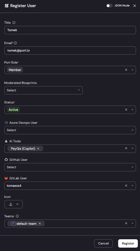
Link Port users to their AI User profiles
The AI Tools relation (ai_tools) you added to the User blueprint earlier in this guide points to one or many ai_user entities. All the aggregations defined here at the user, team, and organization levels traverse this relation: a Port user with no ai_tools link will show zero Copilot activity even if a matching ai_user entity exists.
Once the integration has created the ai_user entities, link each Port User to their matching Copilot profile. For a small number of users, you can assign them manually in the UI:
- Go to your software catalog and open the User entity for the person you want to link (or create a new User entity if needed).
- In the AI Tools field, select the matching
ai_userprofile (e.g.mk-armah (Copilot)). - Save the entity.
Automate this step
For larger orgs, doing this one-by-one in the UI is slow. You can populate the ai_tools relation automatically in several ways:
- Port AI: ask Port AI to link every Port User to their matching
ai_userprofile by email or username. It is the fastest option for one-off bulk runs and requires no code. - Integration mapping: extend the User-creation mapping in your SCM integration (e.g. GitHub, GitLab, Azure DevOps) so that whenever a User entity is upserted,
ai_toolsis set via a query lookup againstai_user(match on email orcopilot_username). See the Engineering Intelligence data model guide for examples of relation lookups in mappings. This keeps the link in sync as new users join. - Automation: create a Port automation that triggers when an
ai_userentity is created and upserts the matching Port User (by email or login), settingai_toolsto that profile. This links users reactively as theirai_userprofiles appear, without touching the SCM mapping. As with the mapping option, make sure the upsert preserves any existingai_toolsvalues if you run more than one AI tool. - Scripts / API: run a one-shot script against Port's REST API to bulk-patch User entities. Useful for backfills or when matching logic is more complex than what a mapping can express. :::
Aggregation and calculation property values are recalculated for all entities of a blueprint on a periodic cycle (roughly every 15 minutes, see aggregation property limitations). After you create these properties, resync the integration, or link a Port user to their ai_user profile, the metrics at the user, team, and organization levels may show 0 or empty for up to ~15 minutes even when everything is configured correctly. This is expected, so wait for the next recalculation before troubleshooting an empty dashboard. If values are still 0 after the recalculation window, then check the ai_tools link and the underlying ai_user data as described above.
Visualize metrics
We will create a dedicated dashboard to monitor GitHub Copilot adoption using Port's customizable widgets. The dashboard is organized into sections covering headline KPIs, distribution by adoption tier, team-level adoption, top contributors, low engagement, inactive users, and daily activity trends.
Create the dashboard
First, let's create an Engineering Intelligence folder to organize your dashboards (if you have not already), then add the GitHub Copilot AI Adoption dashboard inside it:
- Navigate to your software catalog.
- Click on the
+ Newbutton in the left sidebar. - Select New folder.
- Name the folder Engineering Intelligence and click Create.
- Inside the Engineering Intelligence folder, click
+ Newagain. - Select New dashboard.
- Name the dashboard GitHub Copilot AI Adoption and click Create.
Add widgets
You can populate the dashboard using either an API script or by manually creating each widget through the UI.
- API script
- Manual setup
The fastest way to set up the dashboard is by using Port's API to create all widgets at once.
Get your Port API token
-
In your Port portal, click on your profile picture in the top right corner.
-
Select Credentials.
-
Click Generate API token.
-
Copy the generated token and store it as an environment variable:
export PORT_ACCESS_TOKEN="YOUR_GENERATED_TOKEN"
If your portal is hosted in the EU region, replace api.port.io with api.port-eu.io in the dashboard creation command below.
Create the dashboard with widgets
Save the following JSON to a file named copilot_ai_adoption_dashboard.json:Dashboard JSON payload (click to expand)
Then run the following command to create the dashboard with all widgets:
curl -s -X POST "https://api.port.io/v1/pages" \
  -H "Authorization: Bearer $PORT_ACCESS_TOKEN" \
  -H "Content-Type: application/json" \
  -d @copilot_ai_adoption_dashboard.json | python3 -m json.tool
The script assumes an engineering_intelligence folder already exists in your catalog. If you haven't created it yet, follow steps 1-4 in the create the dashboard section first, otherwise you will run into an error when you run the script.
Headline KPIs
Start with the top-row tiles that give an at-a-glance view of Copilot adoption health. Click Title: Description: Choose the User blueprint. Select Add this JSON to the Additional filters editor: Click Save.Adoption rate (click to expand)
+ Widget and select Number Chart.Adoption Rate.% of users actively using Copilot.Display Single Property Chart type and choose Organization as the Blueprint.default-org.AI Copilot Adoption Rate (%) (ai_copilot_adoption_rate) as the Property.%.Active users (click to expand)
+ Widget and select Number Chart.Active Users.Users who used Copilot this month.Display Single Property Chart type and choose Organization as the Blueprint.default-org.AI Copilot Active Users (Monthly) (ai_copilot_active_users_monthly) as the Property.custom and Custom Unit to users.Users by adoption tier (click to expand)
+ Widget and select Pie Chart.Users by Adoption Tier.User adoption distribution (Copilot only).Copilot Adoption Tier (adoption_tier) as the Breakdown by property.Inactive users (%) (click to expand)
+ Widget and select Number Chart.Inactive Users.Users with zero usage.Display Single Property Chart type and choose Organization as the Blueprint.default-org.Copilot Inactive Users (%) (ai_copilot_inactive_license_rate) as the Property.%.Inactive users (this month) (click to expand)
+ Widget and select Number Chart.Inactive Users (this month).Users with zero Copilot activity this month.Display Single Property Chart type and choose Organization as the Blueprint.default-org.Copilot Inactive Users (Monthly) (ai_copilot_inactive_users_monthly) as the Property.custom and Custom Unit to users.High adopter rate (click to expand)
+ Widget and select Number Chart.High Adopter Rate.% of Port users who reached High adoption tier (16+ days).Display Single Property Chart type and choose Organization as the Blueprint.default-org.Copilot High Adoption Rate (%) (ai_copilot_high_adopter_rate) as the Property.%.
Team adoption
Compare Copilot adoption metrics across teams to identify outliers. Click Title: Description: Choose the Team blueprint. Add this JSON to the Initial filters editor to show only teams (not groups): Click Save. Click on the In the top right corner of the table, click on Manage Properties and add the following columns: Sort by Click on the save icon in the top right corner of the widget to save the customized table.Copilot adoption per team (click to expand)
+ Widget and select Table.Copilot adoption per team.Teams ranked by Copilot adoption rate.... button in the top right corner of the table and select Customize table.
ai_copilot_adoption_rate): Share of team members active on Copilot.ai_copilot_acceptance_rate): Team-level acceptance rate.ai_copilot_loc_efficiency): Share of suggested lines that landed in code.ai_copilot_loc_added_monthly): Sum of Copilot-accepted lines for the team.ai_copilot_adoption_tier): None / Low / Medium / High.total_members): Direct members plus child team members.ai_copilot_active_users_monthly): Number of team members active on Copilot.ai_copilot_high_adopters_monthly): Team members in the High tier.AI Copilot Adoption Rate (%) descending.
User contributors and engagement
Surface top contributors, low-engagement users, and Copilot users with zero output to drive targeted enablement. Click Title: Description: Choose the User blueprint. Add this JSON to the Initial filters editor: Click Save. Click on Customize table and add the following columns: Sort by Save the customized table. Click Title: Description: Choose the User blueprint. Add this JSON to the Initial filters editor: Click Save. Click on Customize table and add the following columns: Sort by Save the customized table. Click Title: Description: Choose the User blueprint. Add this JSON to the Initial filters editor: Click Save. Click on Customize table and add the following columns: Sort by Save the customized table.Copilot user contributors (click to expand)
+ Widget and select Table.Copilot User Contributors.Copilot users who actively accepted suggestions and added AI-generated lines of code this month.
copilot_loc_suggested_monthly).copilot_loc_added_monthly).copilot_loc_efficiency).copilot_acceptance_rate).$team).Copilot LOC Added (Monthly) descending.Low engagement users (click to expand)
+ Widget and select Table.Low Engagement (≤5 Days).Active Copilot users with fewer than 5 days of usage this month.
copilot_days_active_monthly).copilot_acceptance_rate).adoption_tier).$team).Copilot Days Active (Monthly) ascending.Port users using Copilot with no output (click to expand)
+ Widget and select Table.Port Users using Copilot with no output.Active Copilot users with zero lines of code added this month, or users marked Copilot-inactive.
copilot_acceptance_rate).copilot_days_active_monthly).copilot_loc_added_monthly).$team).Copilot Days Active (Monthly) ascending.
Copilot activity trends
Track day-over-day Copilot usage, LOC volume, acceptance rate, and Chat/Agent adoption.
The activity-trend widgets aggregate the githubCopilotUserUsage records directly, so they include all GitHub Copilot users, including users who do not have a matching Port User entity. This is intentional: at the day-by-day level you usually want the full activity picture, whereas the user/team tables above are deliberately scoped to people you manage in Port.
Copilot activity trends (click to expand)
- Click
+ Widgetand select Multi Line Chart. - Title:
Copilot Activity Trends. - Description:
Daily suggestions generated vs accepted. - Add a line:
- Title:
Suggestions Generated. - Blueprint:
GitHub Copilot User Usage. - Chart type:
Aggregate Property Values. - Function:
sum. - Property:
Code Generation Activity Count(code_generation_activity_count). - Measure time by:
record_date.
- Title:
- Add another line:
- Title:
Suggestions Accepted. - Blueprint:
GitHub Copilot User Usage. - Chart type:
Aggregate Property Values. - Function:
sum. - Property:
Code Acceptance Activity Count(code_acceptance_activity_count). - Measure time by:
record_date.
- Title:
- Set X axis title to
Dateand Y axis title toCount. - Set Time interval to
dayand Time range tolast 3 months. - Click Save.
Chat & agent adoption (click to expand)
- Click
+ Widgetand select Multi Line Chart. - Title:
Chat & Agent Adoption. - Description:
Chat & agent feature adoption. - Add a line:
- Title:
Chat Usage. - Blueprint:
GitHub Copilot User Usage. - Chart type:
Count Entities. - Function:
count. - Measure time by:
record_date. - Filter:
used_chat = true.
- Title:
- Add another line:
- Title:
Agent Usage. - Blueprint:
GitHub Copilot User Usage. - Chart type:
Count Entities. - Function:
count. - Measure time by:
record_date. - Filter:
used_agent = true.
- Title:
- Set X axis title to
Dateand Y axis title toDays. - Set Time interval to
dayand Time range tolast 3 months. - Click Save.
LOC trends (click to expand)
- Click
+ Widgetand select Multi Line Chart. - Title:
LOC Trends. - Description:
Lines suggested vs added. - Add a line:
- Title:
Lines Suggested. - Blueprint:
GitHub Copilot User Usage. - Chart type:
Aggregate Property Values. - Function:
sum. - Property:
LOC Suggested To Add(loc_suggested_to_add_sum). - Measure time by:
record_date.
- Title:
- Add another line:
- Title:
Lines Added. - Blueprint:
GitHub Copilot User Usage. - Chart type:
Aggregate Property Values. - Function:
sum. - Property:
LOC Added(loc_added_sum). - Measure time by:
record_date.
- Title:
- Set X axis title to
Dateand Y axis title toLines. - Set Time interval to
dayand Time range tolast 3 months. - Click Save.
Acceptance trend (click to expand)
- Click
+ Widgetand select Multi Line Chart. - Title:
Acceptance Trend. - Description:
Acceptance rate over time. - Add a line:
- Title:
Acceptance %. - Blueprint:
GitHub Copilot User Usage. - Chart type:
Aggregate Property Values. - Function:
average. - Property:
Acceptance Rate(acceptance_rate). - Measure time by:
record_date.
- Title:
- Set X axis title to
Dateand Y axis title to%. - Set Time interval to
dayand Time range tolast 3 months. - Click Save.
Extending to other AI tools
The data model in this guide is deliberately structured so that GitHub Copilot is just one tool plugged into a tool-agnostic foundation. You can layer Claude Code, Cursor, or any other AI coding assistant on top of the same backbone by following the same pattern.
The pattern
Each AI tool follows the same four-layer structure:
- Raw daily activity lives in a tool-specific blueprint (e.g.
githubCopilotUserUsagefor Copilot, an equivalentclaudeCodeAnalyticsorcursorUserUsagefor other tools). Each record is one user-day of activity. - Per-tool user profile rolls daily records up to the month on the AI User Profile (
ai_user) blueprint. Thetoolenum (Copilot,Claude, etc.) discriminates one tool from another, and each user has oneai_userentity per tool they use. - Per-tool org profile rolls daily org-level records up on the AI Org Profile (
ai_org) blueprint, same pattern. - Cross-tool synthesis lives on the User, Team, and Organization blueprints. Aggregations sum across all linked
ai_userentities filtered bytool, so adding a tool is purely additive. Existing Copilot metrics keep working.
Next steps
Once your dashboard is in place, consider these additional improvements:
- Set up scorecards to grade teams against Copilot adoption targets (e.g. ≥60% active users, ≥40% acceptance rate).
- Create automations to send Slack notifications when a team's adoption rate drops below threshold, or to flag Copilot users who have been inactive for two consecutive months.
- Correlate adoption with engineering outcomes by overlaying Copilot adoption against PR delivery metrics, DORA metrics, or pipeline reliability to see whether higher AI usage correlates with shorter cycle times, higher deployment frequency, or fewer failures.